Whispers of the Palette: What Your Handmade Colors Are Truly Saying (and Quietly Doing) for You
Whispers of the Palette: What Your Handmade Colors Are Truly Saying (and Quietly Doing) for You

Here we are, deep into January. The holiday bustle has settled, leaving behind a quiet hum that feels both expansive and a little bit chilly. For many of us, this time of year is a gentle invitation to slow down, to gather our thoughts, and to simply… be. As a wife and mother juggling my own creative passions, I find myself looking for those pockets of calm, those moments where my hands and heart can connect without the pressure of a grand production.
And what better way to do that than with color? It's not just a decoration; it's a quiet language, a subtle whisper that speaks volumes in our handmade creations, and surprisingly, within ourselves too.
The Gentle Language of Intention
Every hue holds a little piece of psychology, a feeling it evokes without us even consciously realizing it. When we choose a color for a handmade card, a knitted scarf, or a digital painting, we're not just picking something pretty. We're often intuitively reaching for a feeling, an intention, or even a quiet longing.
Think about it. In the crisp, fresh start of January, what colors are you drawn to? Are you seeking warmth or serenity? A spark of newness or a soft embrace?
Red: A Cozy Spark, Not a Roar
Often associated with passion and energy, in our handmade world, red can be a lovely, warming anchor. Perhaps a deep cranberry or a muted terracotta. It’s like a warm cup of tea on a cold day – comforting, grounding, and a reminder of life’s gentle vibrancy, rather than an urgent shout.
Blue: The Deep Breath You Didn't Know You Needed
Ah, blue. The universal sigh of calm. Shades of dusty blue or a soft periwinkle in January designs can feel like a quiet moment by a frosty window, a clear mind, or the gentle hush before dawn. It’s perfect for evoking a sense of peace and reflection, inviting us to simply sit for a while.
Green: A Whisper of New Growth
While the trees outside might still be bare, green offers a quiet promise of spring. A muted sage or an earthy moss can symbolize new beginnings, renewal, and balance. It's a hopeful color, reassuring us that even in stillness, life is always preparing for its next gentle unfolding.
Yellow: Your Own Pocket of Sunshine
On gray January days, a touch of gentle yellow – think soft butter or a pale lemon – can be a welcome lift. It’s cheerful without being overwhelming, a little spark of optimism that reminds us of warmth and light. It's like finding a ray of sunshine peeking through the clouds, a quiet joy.
Neutrals (White, Beige, Grey): The Space to Just Be
Sometimes, the greatest gift is space. Creams, soft whites, and gentle grays create a canvas for rest. They are the colors of quietude, allowing other elements (or our own thoughts) to come forward without competition. They remind us that calm is a feature, not an afterthought, and offer visual breathing room to simply exist.
From Complex Ideas to Creative Slowdown with ArtInScience
The idea of choosing colors and designing something from scratch can feel daunting, especially when our minds are always running. Sometimes, the "doing" can overshadow the "being." This is precisely where our ArtInScience tools come in as gentle companions.
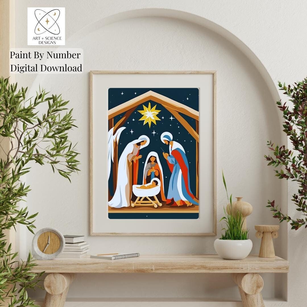
Think of digital coloring pages, paint-by-numbers, or even our thoughtful design brushsets. They bridge the gap between complex ideas and the simple, soul-nourishing act of creative rest. They don't demand you master color theory or understand every nuance of design; instead, they offer a framework, a soft guide. You still get to make those wonderful color choices, to feel the gentle flow of creation, but without the pressure of a blank slate or the intricate planning.
These tools are designed for a creative slowdown. They invite you to lean in, to experiment with a palette that feels right for your spirit in that moment. They help quiet the noise, allowing your inner world to settle and your intuition, guided by color, to gently lead. It's about finding that calm, meditative space where your hands are busy, but your mind is at peace, simply *being* with your design.
So, as we settle into this new year, I encourage you to consider the silent language of color in your handmade endeavors. It's more than just aesthetics; it's a way to nurture your spirit, to find moments of quiet joy, and to infuse your creations with genuine intention.
How are you carving out your quiet moments, truly protecting them, this January? I'd genuinely love to hear.

Feeling Inspired?
Coloring pages, paint-by-number designs, and brushsets can be a surprisingly grounding way to slow your mind.
Visit my Etsy shop, explore Creative Fabrica, or grab a freebie via LinkTree.
#ebooks #hobbies #simplelifestyle #etsy #instantdownload #artinsciencedesigns #creativefabrica #coloring
Comments
Post a Comment